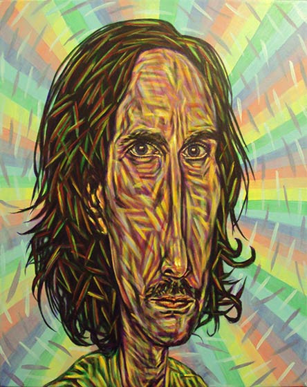
My color over color, straight out of the tube technique lends a strong element of Impressionism to my paintings’ Regressionist style. Developing the technique has taken a lot of practice over the years, so I wanted to document this evolving style as it stands today. This tutorial shows the method step by step using a self-portrait entitled Ultraviolet.
Step 1 – Outline
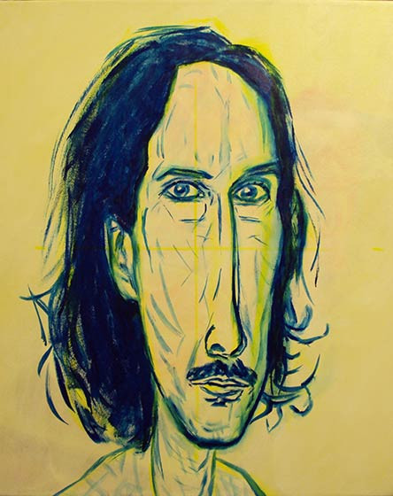
The first step is a simple outline involving 2 colors. Using yellow, I grid my canvas into 4 sections to help approximate the dimensions as accurately as possible. Yellow is so light that it will automatically be covered by the multiple steps of subsequent colors that follow. I grid my reference image the same way, and have trained my eye to stretch the nose extra long so that the face resembles a Moai statue. I continue to roughly outline the dimensions of the face in yellow, not striving for great accuracy here.
Next, I use a dark color to outline over the pale yellow outline, this time getting it as accurate as possible. On this portrait, I used dark blue, but violet or green would do just as well.
Step 2 – Flood Color
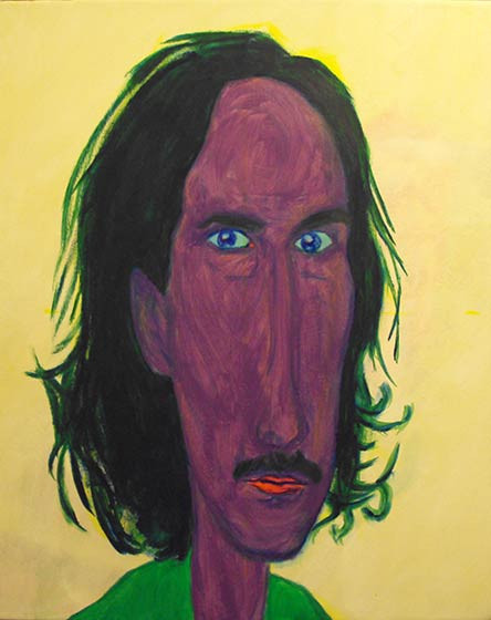
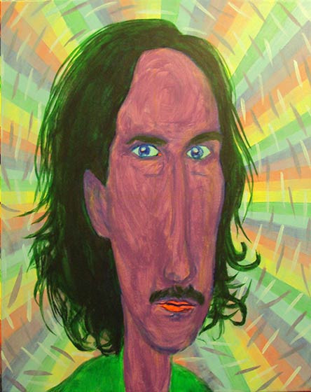
The second step is to color in the figure in the foreground. In this case, I chose violet for my skin color, green hair, blue eyes, red lips, and light green shirt. It covers up the initial outline, leaving barely a trace of the original dark blue.
Step 3 – Background Flood
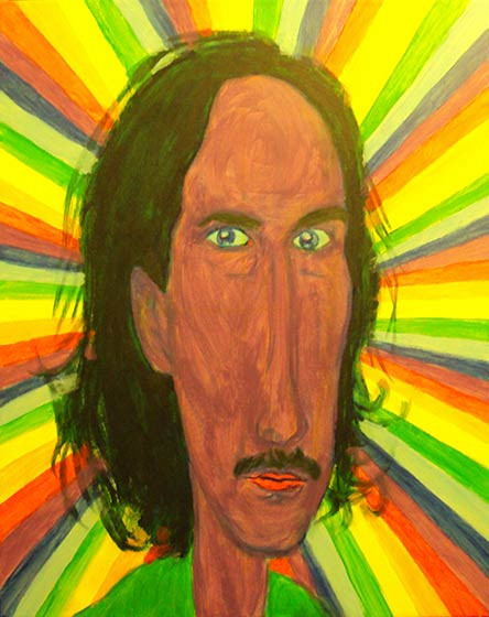
A continuation of the flooding involves filling the background with color. It’s not exactly another step, but it helps to break it down for clarity. Being a self-portrait, I decided to use my most recurring symbols, the singularity (black hole) and the rainbow. Rainbows may look simple, but they always take a while to paint.
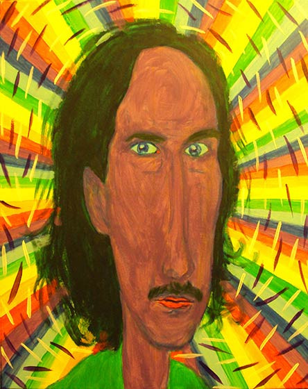
Step 4 – Violet Background Dashes
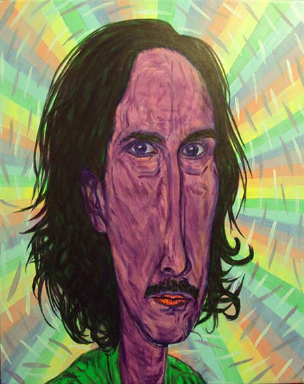
To add texture and motion, I add violet for a dark color. It provides a sense of aura.

Step 5 – White Background Dashes
Adding to the aura, I offset the darkness of violet with white.
Step 6 – Light Blue Flood
The background is still too harsh for my taste, so I lightly flood it out with light blue, just like the color floods the sky in daylight. This softens the background to my liking, so that I can move back to the subject in the foreground.
Step 7 – Violet Outline
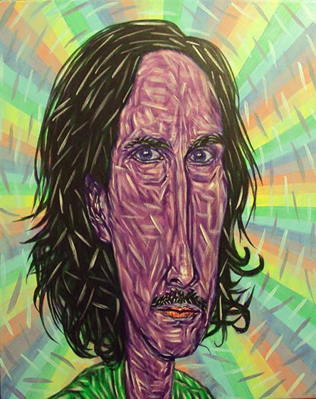
With the color already in place, re-outlining the figure is easier this time, though I do have to be careful to get it accurate. I do a slight bit of shading on this step too.
Step 8 – White Early Highlights
After reestablishing the form with a dark color, I set in early highlights to further establish form. Many artists would probably stop here, but my signature style is characterized by my use of every color of the rainbow. So I continue to color in the figure, knowing that more shading and highlighting will again reestablish the form before I finish.
Step 9 – Light Blue
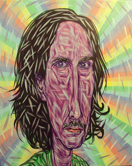
I like to go from one extreme to another, and then soften the difference. I add a lot of light blue along with the highlights because it’s such a natural highlight color. I try to add a lot because it’s still early on, and a lot of it will get covered as more colors are added. This color softens the hard light of titanium white.
Step 10 – Orange
Orange goes right along with the light blue in adding to the highlights while continuing to soften them. It also adds to the structure of the form and brightens up the color, as I’ve chosen a very light variation of the color.
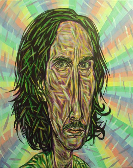
Step 11 – Green Shading
After adding so much light color, dark green is the perfect color to deepen the shades. The form really starts to come in at this step, but I still need to add the primary colors. I save the primary colors for last because of the way they can create secondary colors by overlapping. (Also, notice that I’ve reestablished the white highlights a touch here after the green, as they’ve faded.)
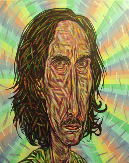
Step 12 – Red
Being the medium of the remaining primary colors, adding red for blush works best at this step. Following its opposite (green), it can add subtle shading and softness at the same time. (Also, I like to quickly reestablish white in the highlights before red if they have faded, which they have in this case. It’s a minor step that I included with the green shading step.)
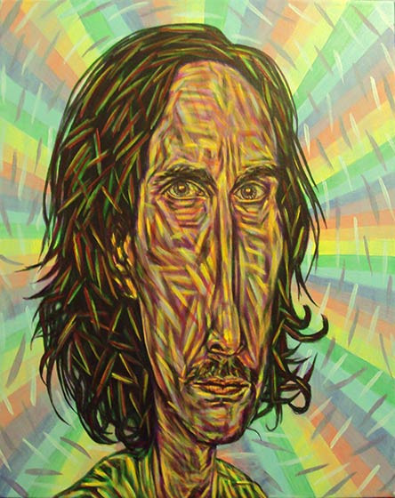
Step 13 – Yellow Highlights
At this point, I trace over all remaining white with yellow. Yellow softens any remaining harshness of the white. It also prepares the highlights for the final touch of white.
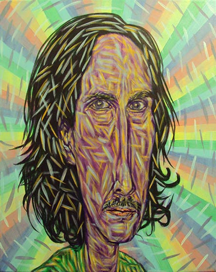
Step 14 – Dark Blue (Indigo) Final Shadow
The final shading color is dark blue, which really deepens the contrast. I like to use hard dashes because they really stand out, especially because dark blue is such a matte color (unlike the glossier red). Also, the color works great for eyelashes.
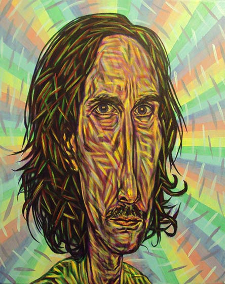
Step 15 – White Final Highlights
Finally, touches of white go over the most glared sections of the highlights, giving it a nice shine.
Finished
Now that every color of the rainbow is present, the only thing left is to sign the picture. One other thing I do is to use a glossy varnish on only the eyes. It gives a sort of realistic effect, and at certain angles to the light, the eyes will blank out, reminiscent of Modigliani’s black eyed portraits. You can check out the finished portrait here. And if you’d like to try your hand using a slightly simpler variation of my technique, I have an older tutorial you could follow.